
Rebranding Rhenish State Theatre 2019: Art of Building and Theatre
Starting Anew
The new visual appearance of the Rhenish State Theatre: How the architecture and its history inspire the look
Reading time: 11 Min.
The month of September 2019 marks a renaissance for the Rhenish State Theatre (Rheinisches Landestheater) in Neuss, the largest traveling state theatre in North Rhine-Westphalia. A new director takes up the artistic directorship for the following 5 years. As with every change in directorship, she and her team are granted the freedom to alter the theatre’s visual appearance. This includes a redefinition of the colour scheme, insignia and visual design – decisions that will leave a visual mark on the building, but also on the cityscape.
In an extensive collaboration, typographer Johannes López Ayala and artists Jennifer López Ayala and Simone Klerx have developed a brand new visual concept for the Rhenish State Theatre. The concept integrates the use of shapes, colours, and type. Moreover, the design team developed a fresh logo and a new pictorial vocabulary for the theatre.
The development process has been driven by two questions: “What’s already there?” And: “What’s still needed?”
Research undertaken in the process shifted the theatre’s architecture and its history into focus, which were defined as central inspiration for the new visual appearance.
“What’s already there?”—an architecture charged with stories that can serve as the starting point of a whole design line.
“What’s still needed?”—a contemporary design that is flexible towards different contexts; a design that is derived from the theatre’s history and at the same time stages the essence of theatre. The architecture of the Rhenish State Theatre shall be displayed once again in its original conceptual form. In this light, the presence of the colour white—a hallmark of the architects—shall be restored. In addition, possibilities to stage the open space of the building façade as an image shall be revived. Lastly, the history of the “heraldic animals” shall be reinvigorated and re-imagined in a human-centered way.
2000—Art of Building
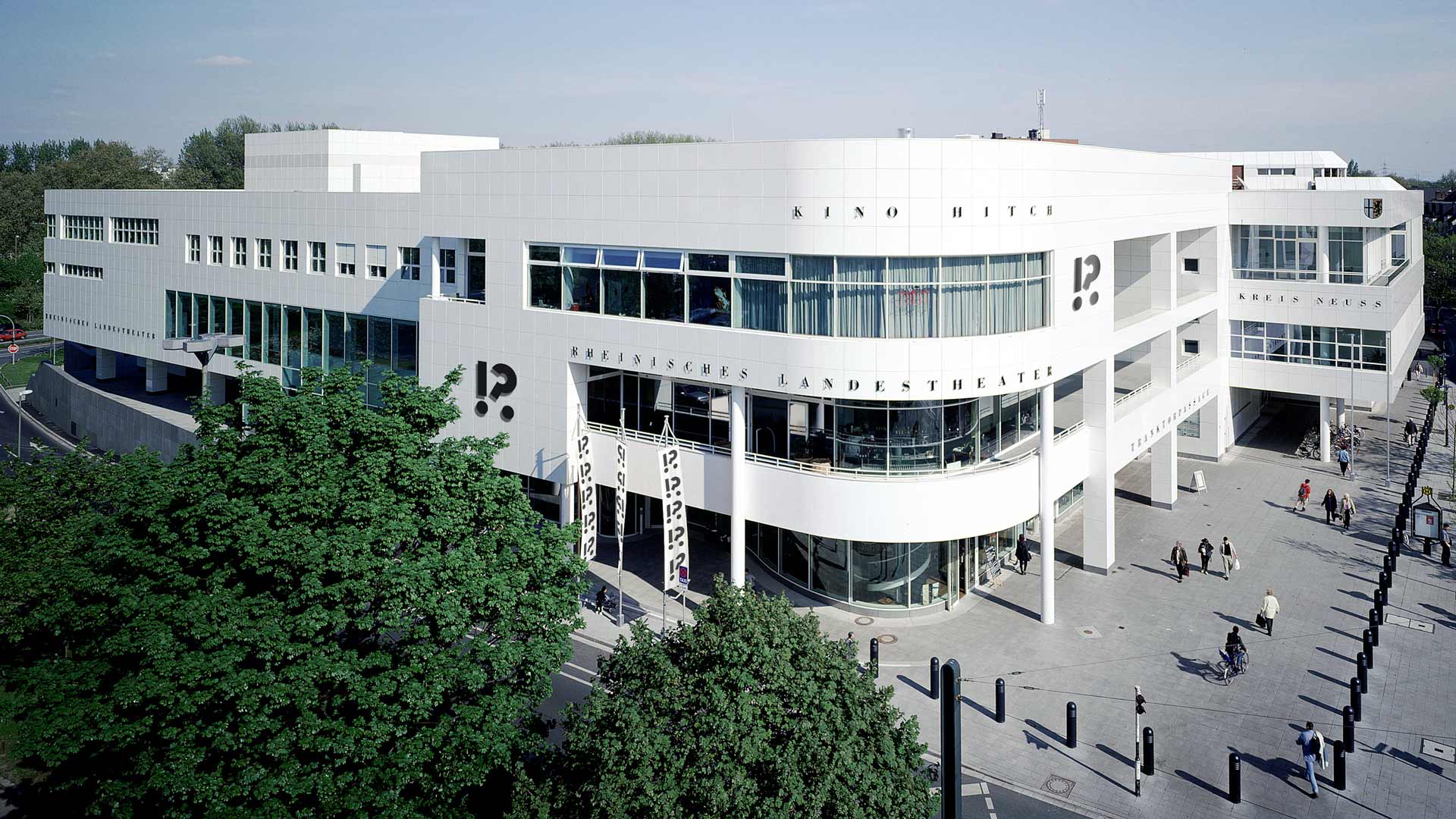
The Rhenish State Theatre is fortunate to be housed in an edifice that is not just a “common building”, but a building that has received recognition beyond regional borders for its prestigious architecture. In 2005, the architects received an award for having realized an Exemplary Building in North Rhine-Westphalia.
The building was designed by Ingenhoven & Ingenhoven, the first joint building venture by father Robert Ingenhoven (d. 2005) and his son Oliver as partner, a “family project”.
In 1998, construction began on the 125,0000 m³ building. Since the completion of a 21-month construction period, the building has been home to the Rhenish State Theatre as well as to the District Administration. In addition, it hosts gastronomy, the “Hitch” art house cinema and a shopping arcade.
At the time of construction, not a completely new building was erected, but instead architects and developers built on an existing building structure – the structure of an empty, insolvent department store. In an interview conducted by Jennifer López Ayala with Oliver Ingenhoven, he explains how he and his father, on their own initiative, developed the vision of revitalizing the “dead” building through new forms of use. Ingenhoven and Ingenhoven immediately recognized the potential of the former department store with its high ceiling and its statics designed for high loading capacity.
During this time, there had already been a desire in the city to grant the Rhenish State Theatre a main seat. The city council had already decided to construct a building for this purpose. However, due to a lack of finances, the construction was postponed to an indefinite time in the future. Against this background, the architect’s proposal to convert the existing building brought the goal of giving the Rhenish State Theatre a new main seat within reach, and was therefore approved. This approval gave rise to a redevelopment project which up to that date had been unique in Germany. For the first time, a department store was completely renovated instead of being demolished, and converted into an economically lucrative venture. With their redevelopment project, Robert and Oliver succeeded in preventing a possible decline of the neighborhood, effected by the vacancy of a large department store – a process that had been observed in other cities. Instead, they laid the ground for an optimal use of the existing land and building material. The current building uses a reinforced concrete skeleton with an axial dimension of 9.5 by 10.6 meters, which was preserved in the redevelopment process together with the four stairwells.
Ingenhoven and Ingenhoven described their design method as the “subtraction of everything superfluous”. They reopened and reinvigorated a once crude self-contained building to the outside world by extending it with a dynamically rounded corner and applying the “segmentation of the surface” as a construction principle: “the architects transformed the huge volume of this inimical cubic block into a well-articulated structure that addresses the town in a friendly, lively manner. Its formal language reveals features of the International Style of the pre-war period.” (Olaf Winkler: “Metamorphosis of a department store – Ingenhoven & Ingenhoven”, page 7. Prestel, 2002).
What inspired the architects to develop this piece of structural art?
1962—Warehouse
In 1962 the “most modern department store in West Germany” was opened in Neuss—first as Merkur, later as Horten. “An aerial photograph shows how the gigantic, subdivided cube with 8,500 m² of sales space on three floors (the fourth floor is the basement) had settled in the small-scaled Neuss city centre. It was a strange and solitary building that made no effort whatsoever to fit into the urban context”, Thomas Brandt wrote in a lecture on the history of the Horten department stores.
In his overview of the development of department store architecture, Hans-Georg Pfeifer remarks: “In order to be noticed by customers driving at 50 km/h through the streets of the cities, a façade design was required that stood out from the architectural environment as an eye-catcher, and at the same time had features that received recognition elsewhere.”
Thomas Brandt states: “For some it appeared to be a temple of consumption, the promise of a new age, for others it represented a disproportionate foreign entity, destroying grown structures.
“At the time of its construction, the Horten department store was considered the most modern of its kind in West Germany. And modern meant mobile, dynamic, individual, international and liberated from rigid work ethics.
“The self-service supermarket on the ground floor alone offered 3,000 different items, food and other ‘essentials for household and kitchen’. Those seeking relaxation found two alternative restaurants in the new building, the ‘Imbissstube’ with 100 seats on the ground floor with a view ‘of the silhouette of the city center with the towers of the cathedral’, and a restaurant for 450 guests on the second floor, the ‘Kupferspieß’, with its own kitchen and confectionery with a view of the greenery.
“Six escalators carried the stream of buyers comfortably from floor to floor, from one attraction to the next. A ‘full air-conditioning system, which could be operated as cold or warm air system depending on the season’ made the stay pleasant for everyone at all times. Three main telephone lines with 50 extensions supported the modern communication, while an intercom system made it possible to reach and inform every employee in every room - ‘This intercom can also be used to broadcast music and information for customers and employees’. Even the increasing number of migrant workers, who worked in the city's industrial enterprises and were not shunned as potential customers, were taken into consideration. For this clientele, Merkur had hired interpreters who spoke Italian, Spanish and Greek.
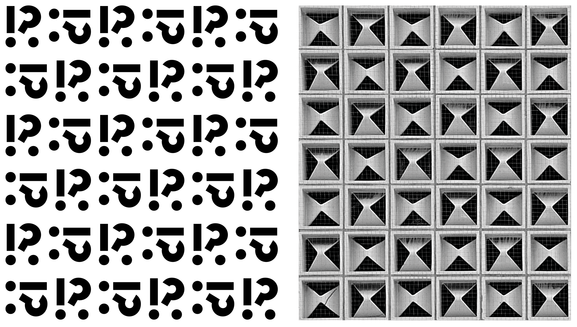
“The external expression of modernity was the so-called ‘honeycomb façade’ made of approx. 11,000 of the famous Horten-tiles. Like a curtain dress they covered the faceless building. Over the years, the fronts of all Horten department stores were made of these tiles to give them a uniform, easily recognizable appearance in the sense of a ‘corporate identity’. In literature, for example, there is often the explanation that the Horten-tile contains a stylized ‘H’, which refers to the name Horten. Later the stylized ‘H’ was also used as a logotype and appeared on flags and shopping bags.
“It is still not completely clear as to who initially conceived the design of the Horten tile in Neuss. Many authors believe that it was the Karlsruhe architect Egon Eiermann (1904-1970) – one of the leading architects for Horten department stores. Eiermann taught at the local university from 1947 onwards in line with the architectural concept of Walter Gropius and Mies van der Rohe, and shaped the architectural history of the young Federal Republic with famous buildings, which is why tile is also often referred to as the Eiermann tile.”
Two strong architectural formal principles therefore served as the basis for the graphic development of the new visual appearance of the Rhenish State Theatre: the opened block of the current theatre building as well as the ornamental effect of the Horten tile. In addition, the graphic development concept builds on the design principles of the revitalized building: “subtraction of everything superfluous” and the graphically conscious use of black and white.
2019—Dramaticon
Formally, the new corporate design refers to these architectural features of the theatre. So what is the connection between the design and the theatre? It is the love of the word.
For the theatre, one element is without a doubt essential: the dialogue. The unanswered questions of life and the challenges of everyday routine, the outstanding eloquence of the great playwrights and the little anecdotes that make life worth living.
The visual component of the spoken word is type. Where there is type, there is also punctuation – fullstop, exclamation mark and question mark, which form the basis of everything that is uttered and whispered, spoken and sung, sobbed and laughed on stage.
In the “Dramaticon”, which is the new icon of the Rhenish State Theatre, the interplay of these punctuation marks culminates in graphic from. The question is found next to the exclamation, the shape of the one turns towards the other, a tension emerges: Exclamation mark and question mark share a full stop and thus become a fourth mark: the interrobang.
The interrobang indicates astonishment, exclamation and question at the same time, or it can mark particularly emphatically asked questions – precisely those questions that are really important. It was invented by the US-American advertiser Martin K. Speckter in 1962 – the same year in which the Merkur department store and subsequent Rhenish State Theatre building opened its doors in Neuss.
But not only punctuation marks are embedded in the Dramaticon. Only at a second glance does the inner structure of the symbol reveal itself. The inner structure combines punctuation marks consisting of the simplest geometric elements – as in the Horten tile – to form a stylized letter: the capital R. “R” for Reise [German for “journey”], “R” for Reaction, “R” for Revolution?
As a symbol that does not want to encapsulate itself in a closed rectangle, the Dramaticon takes up the principles of the iconic theatre building described above to give a dynamic character to the static body. The arc of the question mark is a homage to the rounded corner of the building, while its construction principle – the segmentation of the closed surface – is also reflected in the construction of the icon.
As an open and flexible element, the Dramaticon does not need to be isolated. It is arranged in patterns like the Horten tile, fills surfaces, plays with shapes and architecture and tells stories. Since it is not a closed form, even its individual components can be detached and used playfully and narratively. The abstract then becomes concrete.
The dramaticon becomes the identifying mark and initial of the Rhenish State Theatre. A changeable, memorable icon. It combines drama and dialogue, attraction and contrast, question and answer.
An icon that embodies the theatre through and through. A symbol that builds spaces and fills them with life.
Words: J. López Ayala
Partly based on an Interview with Jennifer López Ayala and Oliver & Heidi Ingenhoven.
Extracts from a lecture about the Horten tile courtesy of Thomas Brandt (www.thomas-brandt-kunst.de)
Translated from German by Bruce Julies
Ingenhoven & Ingenhoven
Projects (selection)
- 2015 Rheintorhafen Neuss
- 2014 Guggenheim Helsinki International Design Competition
- 2014 Kopfgebäude Waterfront Neuss
Awards (selection)
- 2014 2. Preis Fassadenwettbewerb Luxor Filmpalast Heidelberg
- 2013 Deutscher Fassadenpreis
- 2005 Vorbildliches Bauwerk NRW (RLT Neuss)
Tipogris Books and Brands gestaltet Publikationen und entwickelt Brandingsysteme. Oft unkonventionell, immer präzise.
© 2024 Johannes López Ayala / Tipogris Books and Brands. Tipogris® ist eine eingetragene Marke. Impressum / Datenschutz